
Schill Insurance applies best practices to website design
Written by: opacity Categories: Uncategorized
Check it out… our website was featured in this month’s BC Broker Magazine for our creative website design 🙂 Kudos to us! You can download the article: BC Broker – June 2017 or keep on reading below.
Designing websites for optimal user experience
By Grant Patten ~ Digital Media & UX Specialist CSIO
User experience (UX) can be defined as the totality of the experience a user has when interacting with a (usually digital) product – their impressions and feelings, whether they’re successful, whether they feel like coming back again. For brokers, this digital product is usually their website and/or mobile app. Following a UX design process generally means conducting some research and appropriately planning the design of the site before development. Why follow this process? As Roger Pressman stated in his book Software Engineering: A Practitioner’s Approach, “for every dollar spent to resolve a problem during product design, $10 would be spent on the same problem during development and $100 or more if the problem had to be solved after the product’s release.” It therefore pays to follow a UX design process, and one BC brokerage did just that for the development of its website: Schill Insurance Brokers (schillinsurance.com), which was recently named a CSIO Technology Leader (scoring 100% on the CSIO Tech Scorecard).
The Planning Stage
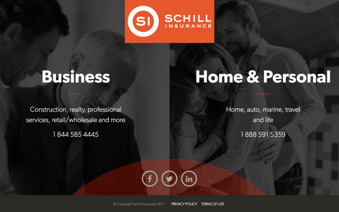
“We take a little pride in being not typical insurance brokers; while we take our industry seriously, we try not to take ourselves too seriously, and we wanted our website to reflect that sensibility,” says Al Schill, President of Schill Insurance Brokers. Schill decided to divide their site into a personal lines site and a commercial lines site to be able to tailor the content to each audience. “We wanted to keep the copywriting on our site authentic – if copy comes across as being boring or overly business-like, it doesn’t resonate with people. So, we made sure to inject some personality into our copy so we’re talking to people on their terms, as opposed to insurance jargon,” says Michelle Meerse, Marketing & Communications Manager at Schill.
The Schill team did some research and competitive analysis of other websites before deciding on the look and feel they wanted for their new site. “In terms of research, since we wanted to challenge the conventional insurance brokerage website, we looked mostly at websites we liked in other industries outside of insurance, such as risk management,” says Meerse. “We documented elements of these sites that we liked, which helped us generate ideas for our own site design.”
Schill worked with a marketing company to help them build the site from start to finish – the total cost of the initial site build was approximately $17,000. One of the first tasks the marketing firm completed was constructing a sitemap to layout the structure and general flow of the site. The firm also did some usability testing on the website prior to launch to iron out some small kinks that existed.
Design & Implementation
“Looking at the analytics of our site, we saw people were often trying to contact us right away, so we made sure to put a strong call-to-action (CTA) to our phone numbers at the top of both our personal and commercial lines sites,” says Meerse. “And because people are often searching for insurance-related content, we also make sure to keep our blog updated with relevant topics and then, throughout the article, link them to the CTA we wish them to take.” Other employees on the Schill team help identify potential content for Michelle to write for the blog, so ongoing content creation is a team effort at Schill.
Schill already had a good idea of the colours and overall theme they wanted, and the marketing firm they worked with helped them build on that colour scheme – heavy on orangey tones – to generate a visually appealing user interface (UI) design for the site. “We’ve found that combining black and white imagery with bright orange colours really makes the webpage ‘pop’ because of the contrast, and helps us emphasize the points we want to get across in a visual way,” says Meerse. The site also makes nice use of white space to let the UI elements “breathe”, without trying to cram too much information onto one webpage. “We wanted to use a good combination of text, images and video but also keep it simple. We went with the premise of ‘less is more’ and didn’t want to present people with too much information at once.”
The Schill Insurance website is a responsive design, which is a site with a flexible layout that creates dynamic changes to the appearance of its webpages, depending on the screen size. “When I first came onto the company four years ago, the website at the time wasn’t responsive, but I felt a need for it because when you looked at the analytics, more than half of visitors were looking at the website through their phone,” states Meerse. “So, we made it a priority to not only make the site responsive but also ensure the most important content comes up first when looking at the site on a mobile device.”
“We also try to project our brokerage personality through the imagery on our site,” says Meerse. The use of authentic-looking, impromptu imagery of people (and sometimes even animals) throughout the Schill website is an effective design choice as there has been research indicating the power of faces in user experience. When users can relate to the images they see, it influences whether or not they stay on your site. Standard stock photos – bland, rehearsed, inauthentic – are typically less relatable. Where possible, use real photos that appeal to your target audience and reflect your brand. A number of websites featuring beautiful, high-res, free photos have been created as a reaction against traditional stock imagery, including Unsplash, Pexels and Death to Stock.
When asked about their advice to brokers interested in building a website of comparable quality, Schill and Meerse noted that their experience in outsourcing most of the design and development to a marketing firm was a positive one, but it’s a matter of finding the firm that works well with your brokerage. “Building and maintaining a good website is a commitment – it’s not just a ‘one and done’. You don’t get to just pay the money and walk away – it’s always evolving,” states Schill. “And as much as we like our current site, we’re already talking about what’s going to change in the next version.”
In terms of what is next on the UX horizon for Schill Insurance Brokers, Al Schill indicated that they’re looking at integrating an extended-hour live chat on their site as one step in their strategy to move closer to being a 24/7 brokerage. Learn about other brokerages that are demonstrating UX design best practices by visiting the CSIO Technology Leaders page on CSIO.com.
Visit the IBABC – BC Broker Website to view the entire magazine.